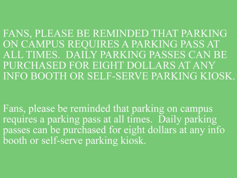
CAN you Read iT?
By Matthew C Wallace
Most all of us have stood the twenty feet away, covered an eye and been asked to read the letters off the Snellen Eye Chart. It’s as commonplace as saying, “Ahhhh”, to the doctor while their tongue depressor agitates your tonsils to a gag. Rather than just being used as optotypes (letters chosen to test visual acuity), what if your announcing copy arrived in this format? Would you be able to reasonably get through it or would it confound you to a frenzy? Perhaps, the above represents the style copy you prefer. I could not say. I can tell you the readability debate (especially, readability online) swirls mercurially from .com board rooms to the corners of obscure coffee haunts with the same disharmony as friendly disputations on politics and religion.
Announcers and Broadcasters alike read a lot of copy and, I mean A LOT of copy…out loud no less. This means we are not just sucking the data from our eyes to our brain. We must bring it into our brains, process it then, spew it back out flawlessly into a microphone for public consumption. And so often, this copy is a real challenge to speak. Why? The reasons are multifarious: poorly written grammatically, written well for reading but not for speaking, verbose for the time allotted, as well as lacking legibility and readability. Certainly, more reasons exist; however, I’m going to stop and focus on legibility.
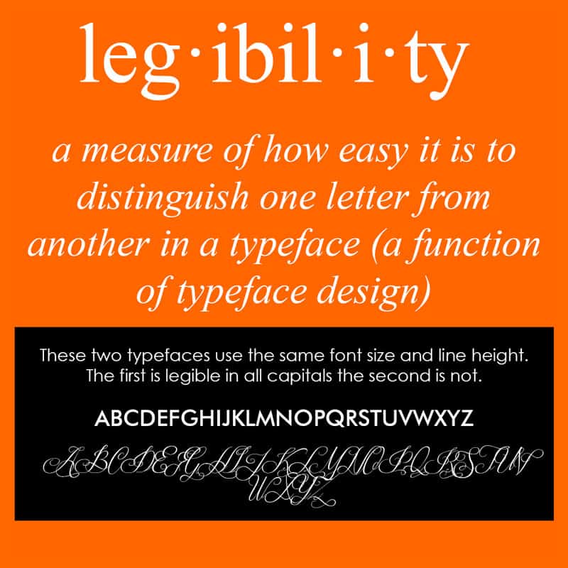
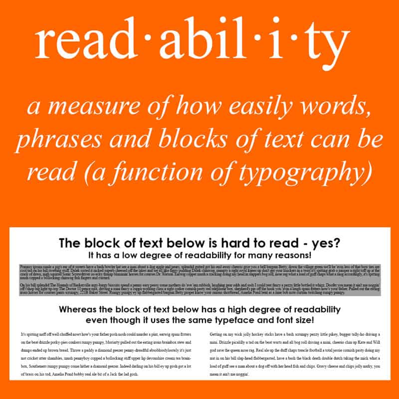
Not being an expert…and to keep it simple and short, legibility refers to typeface. How easily can letters be interpreted by someone. Readability layers above this. Letters arranged into words then phrases, sentences and blocks (or paragraphs). Couple this with spacing between words, lines and paragraphs and, you can determine for yourself how readable something is. I’m not treading the unsettled waters of readability here. Marketing departments might frown upon what I have to say. Plus, I’m not perfect and, I might very well cry if someone reviews my writing style harshly. I’m sensitive. LOL!!!
So copy… Copy is really important to get straight. Much of the copy presented is paid for by businesses and organizations; therefore, the administration is on the hook to get it out there and in the frequency required, typically, by contract. Other copy, such as emergency instructions, is just as critical. Publicly issuing emergency instructions incorrectly… risks lives. Whereas some may frown on marketing copy’s significance, I say, as an announcer, it’s our job to read it all; therefore, it’s all important to get right. To read it well, the type must be pretty darn legible. I want to read it without really thinking about it.
Ok. I ran across a couple articles which took up a hot debate in the website marketing world: mixed case vs all caps. The discussions wrapped around what was more receptive to the eyes. Did all caps make a site more attractive? Easier to read? So, I got to thinking because I’ve had copy given to me in mixed case, all caps and both. Personally and for the longest time, I felt all caps made it easier for me but, figured I’d investigate what might be better in truth as opposed to my uninformed halfwit opinion.
Yes, you’re right! This dips into the wonderful world of typography. Not only did I explore the upper/lower case question but, font, size and space arrived into play as well. I like to make announcing templates for myself and to share with others: basketball, volleyball and etc. I decided I needed to determine a great combination of the aforementioned to ensure the most efficient forms as well as helping me decide on how to redesign my website (websites, like homes, should get slated for the occasional remodeling in my humble opinion…there’s just nothing like starting fresh).
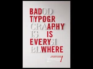
Typeface. I’m going to start here before diving into cases. The reason being is that the typeface makes all the difference in the world. It comes down to invisibility. British designer, Craig Ward, coined the phrase, “Good typography is invisible. Bad typography is everywhere.“ He made a great point. If type is such that we are able to read it without thinking about it, the type is awesome. If, however, we take notice of the type itself, it takes away from the readability. As announcers, we must read quick and accurate. No wiggle room exists to admire or deconstruct a typeface on the fly. Could this be why Times New Roman has survived the test of time? You betcha!
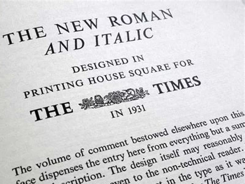
Times New Roman and some of its brothers and sisters are so very boring that we can pick up a newspaper and immediately pump words into our noodles without consciously realizing we are using our noodles to pump. In stark contrast, the same article of the same paper printed entirely in something like Gigi will be eye catching but, drive a reader insane going word by word to read it. Can you imagine the sample to the right being all your copy for a ballgame? With a bit of reader license, I will opine how cute the font is but, not for practical reading at a ballpark. Where reading is concerned, boring letters are pretty much always better.
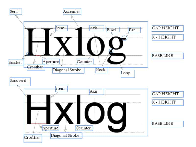
So, some of these typefaces might have little flourishes called serifs. Times New Roman has serifs. Conversely, Ariel does not. Ariel is referred to as sans serif (without serif). Which is more readable? It’s inconclusive; however, the leanings are toward serifs. The consistent remark is serif fonts make letters and words more distinctive. I hand wave. Truly, it is inconclusive. Now, there are some old wives tales about how serif is better for print and sans serif is better for screen. Nonsense. One thing most everyone I’ve read agrees upon is plain, old boring typefaces such as Garamond and Calibri, serif or no serif, are the most readable.
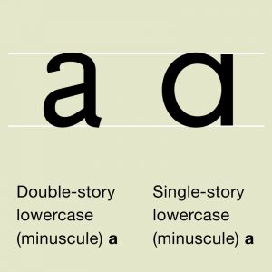
Well, how about size, boldness and other stuff? Point size can help. Apparently, the older you get, the less light feeds into the old retina. So when you arrive at a cantankerous ancient milestone, beg for big point sizes. One site recommended 16 points for website copy to increase receptivity by readers. Wow. In truth, I like bigger point sizes myself on paper. I just find it easier to read through. That’s me I suppose. And counters? Well, a counter is the white space between letters. Turns out to be pretty important stuff. Letters with bigger x-heights (lowercase letter sizes) tend to be more legible since more white space is generated. Of course if the lowercase letters turn out to be taller than the capitals, this will not work out so terrifically either. Everything in moderation…everything in moderation… Two-story letters are better than one story letters as well. I know you’re sitting there asking what the heck that is. See the examples:
What about boldness? Italic? Nopesy! Regular is best. I’m telling you. Plain, old-fashioned, boring, serif’d, proportional x-height, plenty of white space typefaces yield the highest quality legibility and, ultimately, the top readability.
On to how all this started for me…all caps versus mixed case. Gracious!!! Go surf and read. There’s been some incessant, veritable fist fights going on about this one. After studying a fair amount (not PhD effort of course. It’s just a blog people!!!), mixed case retains the edge. Why, you ask? Patterns. Our brains match patterns. Frankly, humans are the greatest, organic pattern-matchers of all time. Check this out:
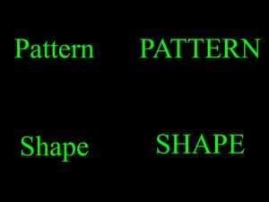
Which seems more of an effort to read? Without a doubt, the all caps is more difficult, although, only slightly. Here’s the deal. Let’s do a little geometry and play with shapes. Look at the words in term of their shapes:

The all caps version is purely a rectangle as opposed the mixed case which has more of a shape to it, kind of like battleships and submarines. Strangely, us humans recognize that shape naturally and in concert with the distinctiveness of the letters, we interpret the word…and fast. In the all-caps version, we lose the ability to take in the distinctive shape and, literally, have to take hard look at the letters to get the word interpreted into our brains. I will take you a step further. Look at the sample copy below:
I did this up in 18 point Times New Roman. I read this to myself multiple times. For me, the mixed case does make the slightest of positive difference. For some, they will say no difference for them at all. Others will prefer the all capitals version. I’m catching on. The top version, essentially, represents a rectangle block filled with individual rectangles. The bottom rendition comprises patterns and shapes arranged into a similar rectangle block. Now that I’m thinking about it right at this very moment, I could not imagine reading a novel of rectangles of rectangles or even a single article of pure rectangles of rectangles, let alone 3-4 pages of copy under the pressure to speak it perfectly to a crowd. Give me the collections of battleships and submarines arranged in neat little rectangles!!!
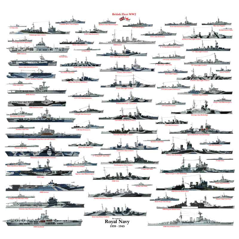
The above, if you squint, sort of looks like a newspaper paragraph, huh. That’s mixed case for you: battleship and submarine patterns. I used the British Navy because my son loves everything British. LOL!!!
When I get my 10 minutes to read over 15 paragraphs of copy, which would I rather be faced with (especially if you have had little to no time to review beforehand): a page of rectangles or page filled with patterns? I didn’t think it would make too much difference until I did up two pages of mock announcements in 14 points: one all-caps, one mixed case. I discovered I needed to focus a bit harder on the all-caps. When I read through the same text in mixed case, I felt slightly less taxed getting the same job done. I know this will not be everyone’s experience but, I’m beginning to understand what all the typographical experts talk about. When I read mixed case with serifs, good counters, multi-story lettering in say 14 points, my experience reading is simply better.

I refuse to go down the pike of handwritten copy. Whenever I get “on the fly“ handwritten copy to read, I want to crumple into a ball then, hand it to the pitcher to use in the ballgame. Since, liberally, under 5% of people I know execute a print handwriting that a civilized person can actually read, I relegate anything penned with a utensil swiped from some archaic, steel government desk to the bowels of the illegible thus, reducing myself to rewriting said copy in my own chicken scratch as I’ll have half a chance of executing that into the microphone. Heaven help me!!!
So with that said, I will be off to look at all my forms for legibility and making changes wherever I can to improve my announcer’s life. After all, announcers announce but, announcers, also, read…a whole bunch. Afterwards, I will be performing plastic surgery all over my website because, as we all know, a fresh coat of paint along with a nip and tuck can do wonders: positive or negative.
Share your opinions on legibility. Share your opinions on readability as well, though caveat emptor with any nearby marketing departments overhearing you complain. Regardless, I always learn from others, especially, when they take the time to point out my mistakes.
About Matthew C Wallace

Matthew C. Wallace is the owner of publicaddressannouncer.org. He is a public address announcer, writer, webmaster, historian, author as well as a former executive and musician. He lives in Los Angeles with his wife and children.
More Announcer Reading